Most trade signage tries to say too much. The result is a ute door or a site board nobody can read from more than a couple of metres away, which means it is costing you money without bringing in calls.
This guide covers trade signage requirements in the practical sense: what has to be there, what earns its place if you have room, and what to cut. It applies to utes, vans, trailers, site boards and the sign on your workshop.
The three-second rule
Someone driving past your vehicle or walking past your job site has about three seconds with your sign. In that window they need to understand three things:
Who you are.
What you do.
How to contact you.
If your signage answers all three in three seconds, it is working. If it does not, nothing else on there matters.
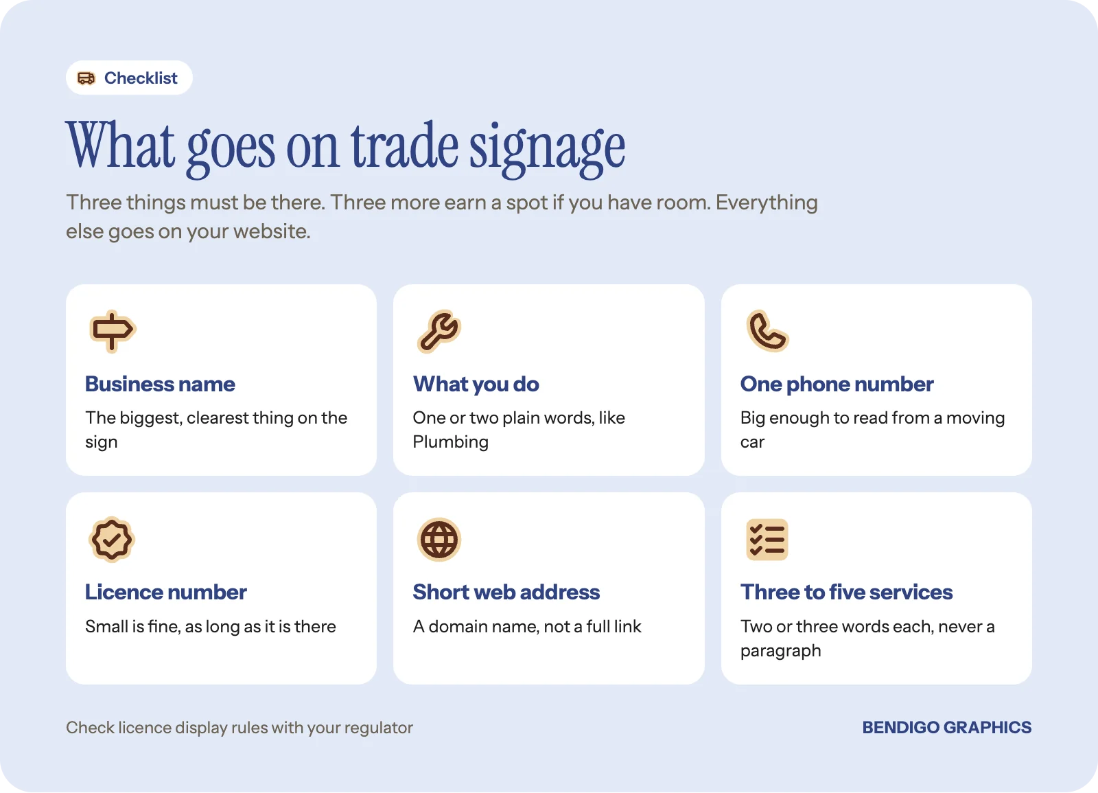
Trade signage requirements: the three things that must be there
Your business name. Obvious, but it needs to be the biggest, clearest element. If people cannot read your name from across the road, the rest is irrelevant.
What you do. Not a slogan. A plain description a stranger understands at once: "Electrical", "Plumbing", "Concreting", "Residential painting". One or two words. If your name already says it, like "Smith Plumbing", you can get away with less here.
One phone number. Large enough to read from a moving car. It is the main action you want people to take, so give it room.
Rule of thumb: name biggest, trade second, phone number big enough to read at a glance. If you have to shrink one of those to fit something else in, cut the something else.
What is worth adding if space allows?
Website or email. Useful, but secondary to the phone. Keep it short: a domain name beats a full web address, and if your email is just info@ your domain, the website covers both.
Licence number. Required for some trades and a trust signal for all of them. If you have one, include it. It can be small, as long as it is there.
A short service list. Three to five items, two or three words each. "New builds, renovations, repairs" works. "Comprehensive residential and commercial electrical services, maintenance and emergency callouts" does not. Nobody reads a paragraph on the side of a ute.
Good to know: licence display rules differ by trade and regulator. Check what your licensing body asks for on vehicles and site signs before you lock in the layout.
What should you leave off?
Long service descriptions. If it takes more than a few words, it belongs on your website.
Lengthy taglines. "Your trusted partner in quality electrical solutions for the greater Bendigo region" is not being read at 60 km/h.
Social handles, usually. Unless your Instagram is genuinely active and brings in work, an @handle is wasted space. The phone number does more.
More than one phone number. An office line and a mobile creates confusion. Pick one and set up a redirect if calls need to go elsewhere.
How should a ute or van be laid out?
On a vehicle, the business name and logo go biggest, the trade description sits below or beside it, and the phone number goes large toward the bottom. The sides tell the story; the rear gives the action, which is the phone number and website for the person stuck behind you at the lights.
Two common options for work vehicles:
Car lettering decals stay on permanently and look like part of the vehicle.
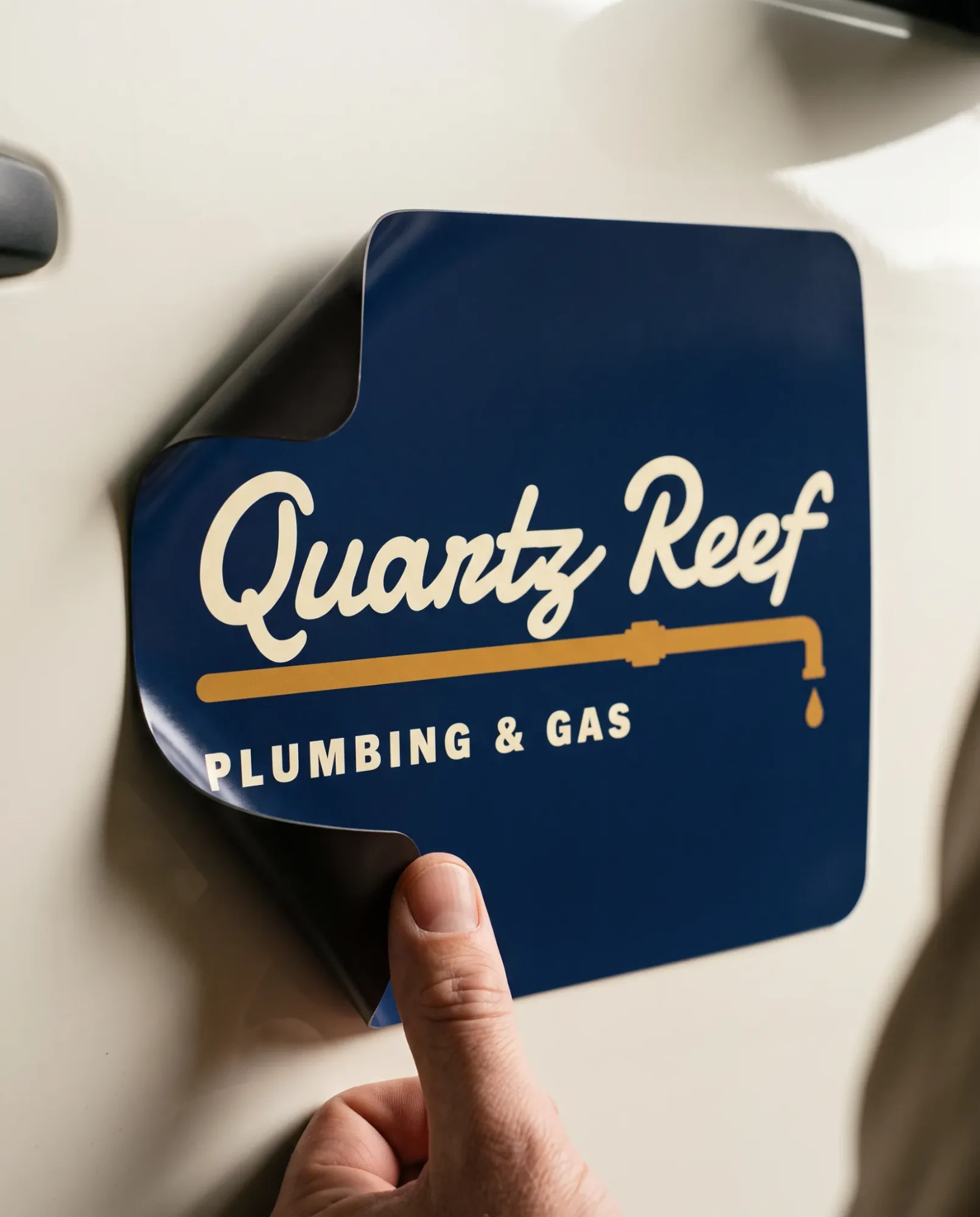
Magnetic car signs come off at the weekend or when the vehicle changes hands.
Our guide on magnetic signs vs vinyl decals weighs them up, and trade vehicle branding covers utes, vans and trailers in more depth. For a trailer, the flat sides are ideal for trailer and truck decals.
Before you order: measure the flat panels on your doors and tailgate and send us those sizes with a side-on photo. Lettering has to sit clear of handles, curves and body lines, so the usable area is usually smaller than it looks.
Vehicle decals are applied by you or an installer you choose. We design the lettering to read at the distances that matter and have it made ready to apply.
What goes on a site sign?
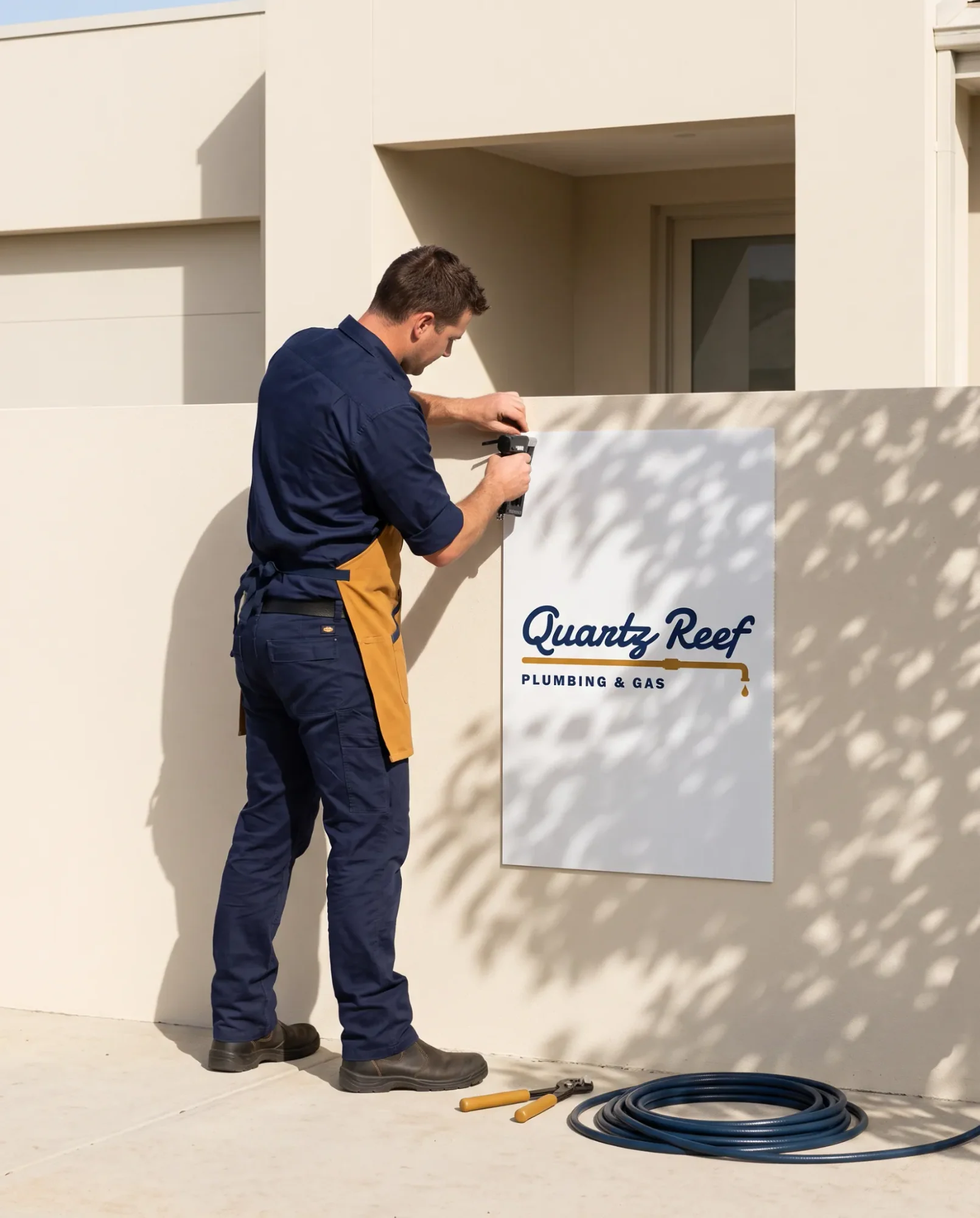
On corflute site signs, keep the same order: business name at the top, trade in the middle, phone number at the bottom. All text should be large enough to read from the footpath opposite, which is roughly 6 to 8 metres depending on the width of the street.
Site signs work hardest on jobs that run for weeks, where neighbours walk past every day and start to associate your name with good work. A tidy board also tells the client you take the job seriously. If you need to post site rules or hazard information, safety signage is made for that and keeps your marketing board uncluttered.
Keep everything saying the same thing
Your ute, site boards, shirts and business cards should all show the same name, logo, colours and phone number. When they match, people recognise you from one place to the next, and a business that looks consistent looks established. If you are starting from scratch, how to make a trade business look more established fast is a good next read.
Common questions
Do I have to show my licence number on my ute?
It depends on your trade and your regulator. Some require it on vehicles and signs; for others it is optional but builds trust. Check with your licensing body before you finalise the layout.
How big should the phone number be?
Big enough to read from a moving car or from across the street. On most vehicles it is the second largest thing after your name. We size it for the viewing distance when we design the layout.
Should I put my Instagram on my van?
Usually not. Unless social media genuinely brings you work, the space is better used making your phone number bigger.
Can you apply the decals for me?
No. We design the lettering and have it made to your measurements, ready for you or your chosen installer to apply.
Get it on the ute
Send us your panel sizes, a side-on photo and your details, and we will design lettering that reads at the distances that matter. See our vehicle graphics range to get started, with live pricing on each product page.