A business that looks considered always beats one that looks expensive. If you want to make a small business look professional, the answer is rarely a bigger budget. It is being consistent, being intentional and being specific about where the money goes.
Here is what makes the most difference, in roughly the order we would tackle it.
How do you make a small business look professional?
Make everything match. Same logo, same colours, same fonts, same tone, across your signage, your cards, your social media, your invoices and your shirts. It does not need to be a big brand identity package. It needs to be deliberate.
A simple logo used everywhere looks far more professional than a complex one that only appears on your business card. If you are not sure whether yours is ready for print, read our guide to logos for printing.
Good to know: getting your logo and colours right once is what keeps every later order affordable. Clean, print-ready artwork can be reused on every card, sign and shirt without paying for the same design work twice.
Why does the stock matter so much?
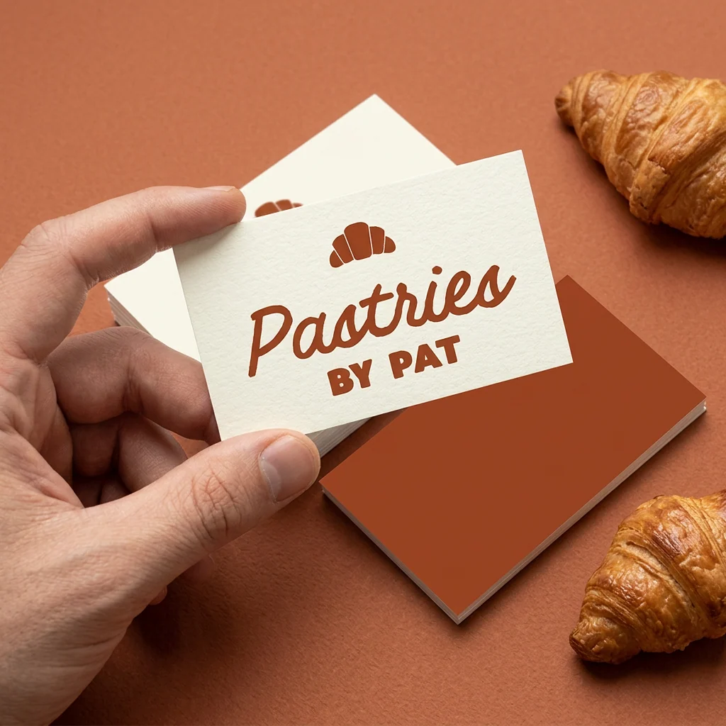
Material is the biggest difference between print that feels professional and print that does not. A 400gsm business card with a matte or soft-touch finish feels substantial in the hand. The same design on thin uncoated card feels like it came off an office printer.
The same goes for everything else. A corflute sign on 5mm board looks sturdier than one on 3mm. A vinyl sticker with a laminate outlasts an uncoated one. The design can be identical; the material is what people feel and respond to.
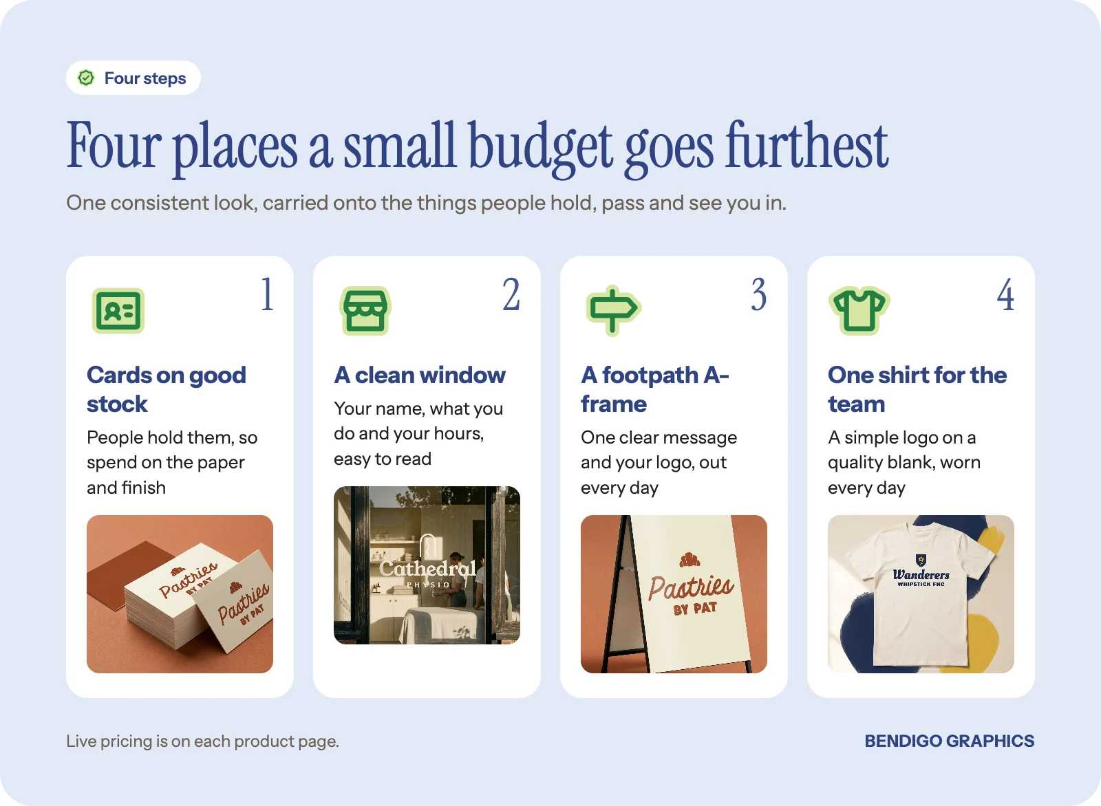
Rule of thumb: if people will hold it, spend on the stock. If people will see it from a distance, spend on the size and contrast. That one split tells you where the money makes the most difference.
Get your signage right
Nothing makes a business look more amateur than tired signage. A handwritten sign in the window. A sun-faded banner. A logo printed at low resolution on a corflute board. Small things like these quietly tell people you do not care about details.
You do not need a lot of signage. You need the right signage, done well. Clean window lettering is often more affordable than people expect, and it changes how a shopfront reads. A solid A-frame with one clear message and your logo can do more work than a full fascia sign. For more ideas, see simple ways to make a shopfront look more inviting.
Branded workwear changes how people see you
A printed polo or tee with your logo is one of the most affordable ways to look established. It is the difference between someone who turned up and a business that turned up. That matters most for trades, cleaning, maintenance and any service where you are inside someone's home or workplace.
A simple one-colour logo on a quality blank like the Classic tee is enough. You do not need embroidery, multi-colour prints or six garment styles. One clean shirt, worn consistently, builds trust faster than almost anything else you can print. Our guide to workwear that lasts on site covers the details.
Stickers and packaging carry your name further
Every time you hand something over, there is a chance to leave a branded impression. A sticker on a takeaway cup. A logo seal on a bag. A thank-you card tucked into a delivery. These are small, low-cost touches, and they make people feel they are dealing with a real operation.
The key is restraint. One well-placed die-cut sticker looks considered. A bag covered in logos looks desperate. Pick one or two touchpoints and do them well.
What actually costs a fortune, and what does not
The big spends are illuminated signage, embroidered uniforms for a large crew and big custom packaging runs. None of them are where a new business needs to start.
The smart spends are a set of business cards on premium stock, a window decal for your shopfront, a handful of printed tees for the team, a run of stickers with your logo and a clean A-frame. Most of the cost in any of these comes from quantity, size, material, finish, the number of colours and how much design time it needs. A small starter kit like that will not win a design award, but it will make you look like a business that takes itself seriously. That is usually enough.
Common questions
Do I need a full brand identity to look professional?
No. A clean logo, one or two colours and a consistent typeface, used the same way everywhere, is what people notice. A full identity can come later as the business grows.
What is the cheapest way to make a shopfront look better?
Usually window lettering and a tidy A-frame. Both are modest spends compared with a fascia sign, and they change how the front reads from the street.
Is embroidery more professional than print on shirts?
Not necessarily. A crisp printed logo on a good blank looks just as considered for most crews. Choose based on the garment and how the shirts will be worn and washed.
Start with the thing people hold: business cards are priced live on the product page. Choose your stock, finish and quantity, then upload your design or have us design it for you.


