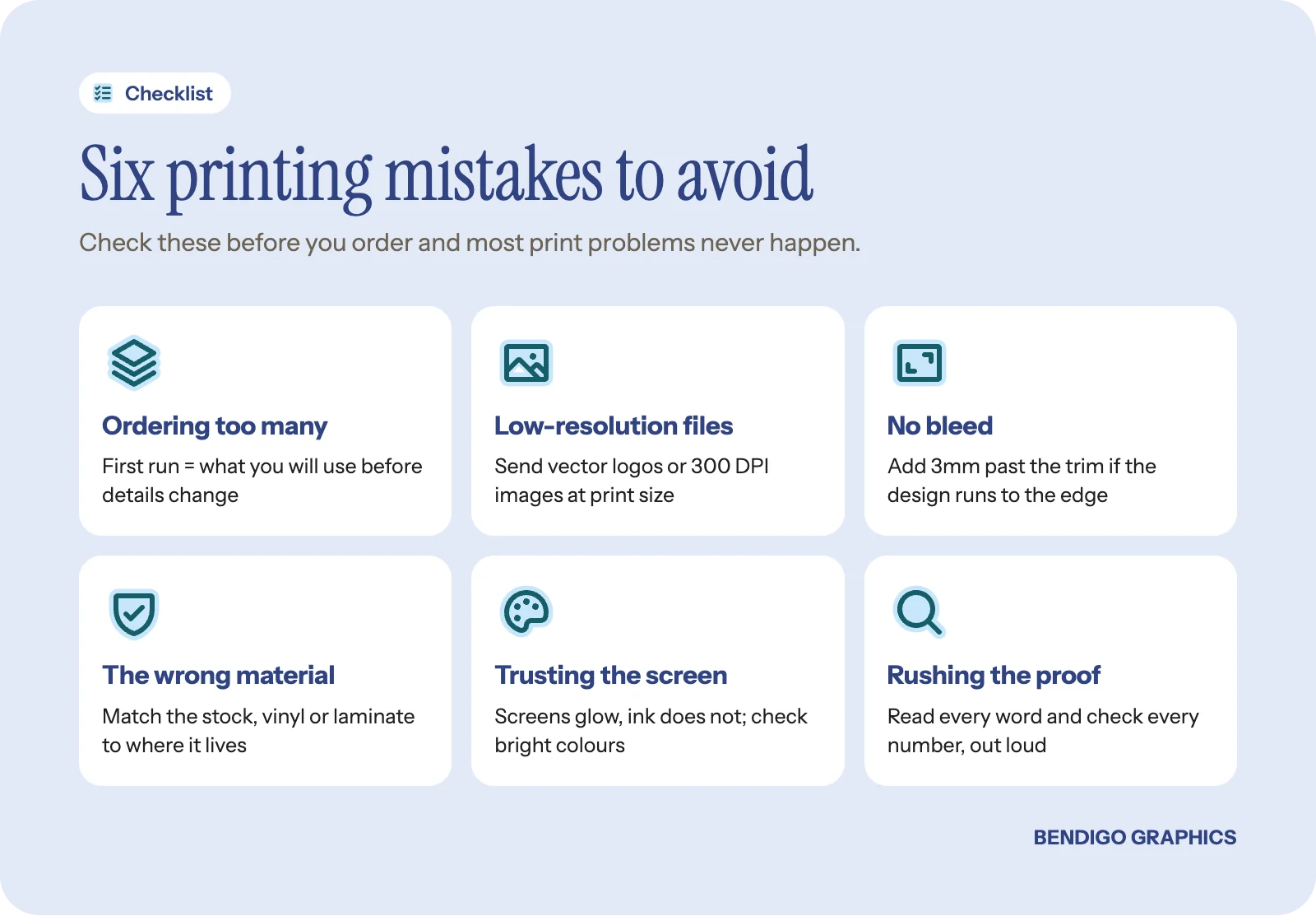
Most printing mistakes have nothing to do with bad design. They come from a handful of assumptions about files, quantities, materials and proofs. Here are the printing mistakes to avoid that we see most often, and the simple habit that fixes each one.
Ordering too many on the first run
The urge to order big makes sense, because each unit costs less. But the first time you print something, restraint saves money. Details change, designs get refined, a tagline stops working or a phone number turns out to be wrong.
Order a sensible first run. For business cards, a couple of hundred is plenty for most people. For stickers, a modest run. For shirts, what your team needs right now. You can always reorder. You cannot un-print a box of cards with last year's website on them.
Rule of thumb: your first run should be the number you will realistically use before something changes. Reordering the same file later is easy, and every product page shows how the price moves with quantity.
Sending low-resolution files
This is the most common technical problem we see. A logo that looks fine on a phone can look terrible printed at 300mm wide. Images pulled from a website, screenshots of designs and logos saved from social media are almost always too low in resolution for print.
For print, images need to be 300 DPI at the size they will be printed. Vector files (Illustrator .ai, EPS, SVG or PDF) are ideal for logos because they scale to any size without losing quality. A small JPEG might just work on a business card but not on a vinyl banner.
Not sure about your files? Send them through and we will check them before anything is made. It is a quick look that saves a lot of disappointment.
Forgetting about bleed
Bleed is extra artwork around the edge of your design that gets trimmed off during finishing. If your design runs right to the edge of a card, sticker or flyer, it needs bleed, usually 3mm on each side. Without it, you can end up with a thin white sliver on an edge where the cut does not line up perfectly.
Most design software can add bleed automatically, so check your export settings. If you are unsure, we can usually add it, but it is easier when it is built into the file from the start. Our guide to preparing files for printing walks through it. If you design in our online editor, every template is already set to the product's true print size with bleed and a safe area shown.
Choosing the wrong material
A business card on thin stock feels cheap. A banner on the wrong vinyl cracks in the sun. A sticker without a laminate fades early. Material matters as much as design, and it is the thing people spend the least time thinking about.
When you order, look at the material options and ask if you are unsure. We will explain the trade-offs between cost, durability and finish. Spending a little more on the right material often buys a much longer life, which is simple arithmetic rather than an upsell. For a feel of the options, see what paper, vinyl and fabric feel like in real life.
Trusting the colours on your screen
Your screen makes colour with light (RGB). Print makes it with ink (CMYK). They do not always match. Neon greens, vivid purples and electric blues can look noticeably different once converted to ink, so the logo that glows on your phone may print as a flatter version.
If colour accuracy matters, and for brand colours it usually does, tell us when you order. If your brand has Pantone references, send them with the artwork. Our guide to brand colours that work in print explains how to choose colours that hold up.
Rushing the proof
Every job should come with a proof: a preview of exactly what will be made. It is your last chance to catch errors. Spelling mistakes, wrong phone numbers, awkward cropping and misaligned elements are all visible on a proof and permanent once it is approved.
Take five minutes. Read every word. Check every number. Show it to someone else. Our local team checks every proof too, but you know your details better than anyone.
Before you approve: read the proof out loud, and check phone numbers, emails and web addresses digit by digit. A second person who did not write the copy will spot what you cannot.
Trying to do everything at once
New businesses often order cards, flyers, banners, shirts and stickers in one hit. The result is usually rushed work across the board, inconsistent designs and a big upfront bill. It is better to choose what to print first, get one or two things right, and build from there.
Common questions
What file format is best for printing?
A print-ready PDF with bleed is the safest. For logos, vector files such as Illustrator .ai, EPS, SVG or PDF are ideal because they scale without losing quality.
What does 300 DPI mean?
It means 300 dots of image detail for every inch of the printed size. An image that is 300 DPI on a small card may be far too low for a banner, because the same pixels are stretched across a much bigger area.
Why do my printed colours look different from my screen?
Screens mix light and printers mix ink, and some bright screen colours cannot be reproduced exactly in ink. Checking the proof and choosing print-friendly brand colours keeps the difference small.
Want it right the first time? Have us design it. We set up the file, check the resolution, bleed and colours, and send you a proof to approve before anything is made.


