You have a lease, a fit-out and a coffee machine or point of sale chewing through the budget. Then someone says "we should probably get some printing done", and a whole new list appears: menus, signs, loyalty cards, stickers, window graphics.
You do not need everything on day one. You do need the pieces that help people find you, understand you and remember you. This shop signage checklist walks through them in the order a customer meets them, from across the road to the moment they leave.
Your shop signage checklist starts across the road
Before anyone orders a coffee or steps inside, they see the shop from the outside. Stand on the opposite footpath and check you can read four things:
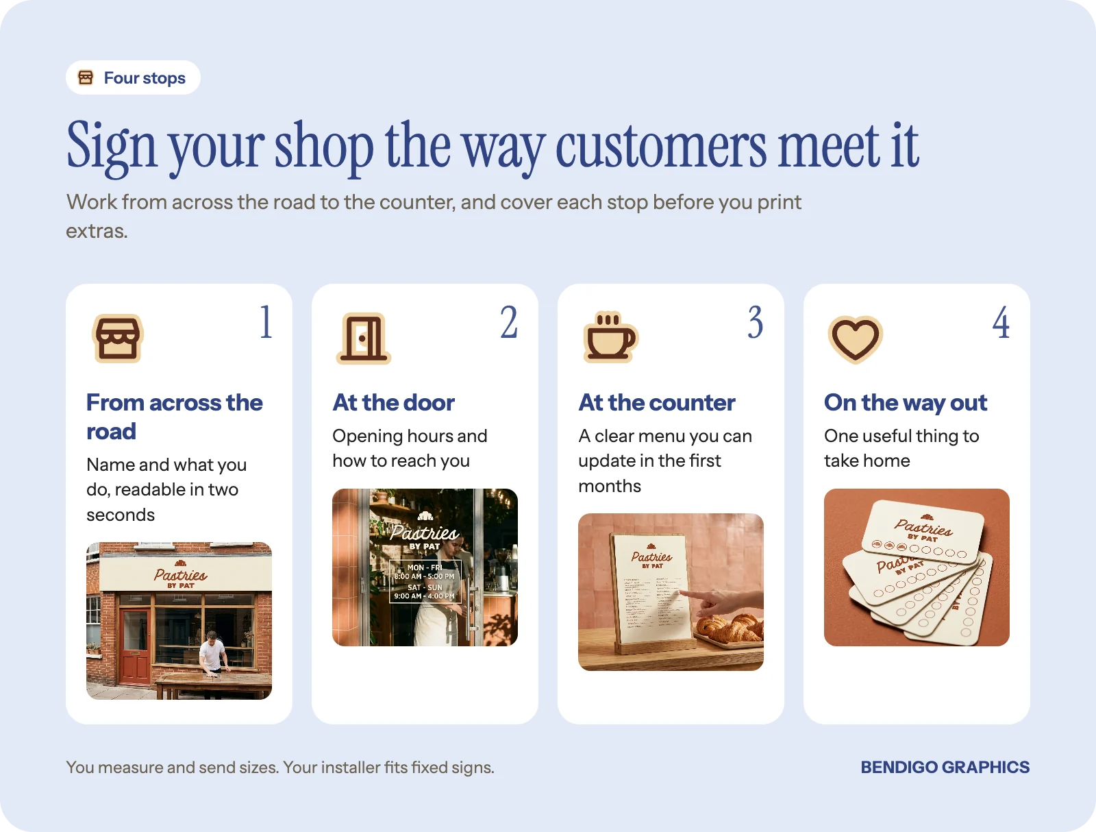
Your name, clearly, from a distance.
A hint of what you are: "Espresso and toasties", "Books and gifts", "Fresh flowers daily".
Your opening hours.
How to reach you, a short web address or one social handle, not every link you own.
If someone cannot answer "what is this place?" in two seconds from across the road, the sign needs work, not more decoration.
This usually comes together as a main sign above the windows, window decals and an A-frame on the footpath. A shopfront sign carries your name and what you do; opening hours decals are one of the simplest ways to tick off hours and contact details on the door.
Quick tip: take two photos on your phone before you brief anyone, one from across the road and one from the doorway. Those two shots answer most sizing and readability questions before design starts.
How big should the sign be?
Viewing distance changes everything. Think about how most people actually pass:
Driving past on a busy street: big, bold letters and a very short message. Thin script fonts disappear at speed.
Walking along a shopping strip: type can be a little smaller with a bit more detail, but it still needs to read quickly.
Tucked down a laneway or arcade: you may need extra wayfinding, such as a window sign at eye level, an A-frame at the corner or a simple panel with an arrow.
Readability comes from contrast and restraint. Dark text on a light background (or the reverse) beats pale on pale every time. Stick to one main font, maybe one for accents. If you already have brand colours, we can work them in while keeping the message clear.
Measure the space yourself (width and height of the fascia, window or wall area) and send us the sizes with your photos. Smaller pieces like A-frames, pull-up banners, corflutes and window decals are easy to put up yourself. Larger fixed signs are usually fitted by your builder or a sign installer you choose. For help with sizes, see what size sign or banner do we actually need.
What should an opening sign actually say?
The temptation is to put everything on it. Resist. A short stack works hard:
Business name.
What you do.
Optional: one clear benefit or style line.
Web or social, if it is simple.
A cafe might run its name, then "Espresso, toasties and good tunes". Hours and a "Now open" message can live on a separate temporary sign so the permanent one never dates.
Check landlord and council rules first
Your lease may limit what you can attach to the building, how big the sign can be and where it can go. Some areas and building types need council approval, particularly if you are changing an existing sign structure or adding a new one.
Before you order: get your landlord's signage rules in writing and check with council if you are changing or adding a sign structure. Design to those limits from the start and you only pay for artwork once.
Send us a photo of the shopfront and any landlord notes and we can tell you what looks straightforward, what needs checking, and which ideas are best skipped before you spend money on artwork.
Menus and price lists for opening week
For hospitality, the menu is your daily script. For shops, clear price lists or section signs do the same job.
Cafes usually want a main menu (table menus or a wall board), a takeaway list for people grabbing and going, and simple specials signs you can change without reprinting everything.
Keep the first run flexible. Prices and dishes shift in the first few months as you learn what sells. A well designed A4 menu in holders means updating is a quick reprint, and you can move to a permanent board once things settle. Our guide on menus, what works and what wears out covers materials.
For retail, think about how people move through the space: clear section headers, shelf talkers and small offer signs ("Locally made", "New this week") help customers feel confident.
Good to know: ask for your menu to be set up as a template. When a dish or price changes, it becomes a quick edit and reprint rather than a new design.
Take-home prints and the little branded touches
Once someone has visited, the next job is getting them back. Small in-hand prints do that well when they are useful:
Loyalty cards with one simple, clear offer.
A takeaway menu people can stick on the fridge.
Business cards at the counter with your name, what you sell and how to find you.
Thank-you or care cards in bags, covering returns, care or reordering.
A few subtle touches also stop you feeling like a temporary pop-up: stickers for takeaway cups and bags, an "Order here, pick up here" sign so the counter is not chaotic, table numbers that look like they belong, or swing tags on your key products. They signal that you care about detail, which gives people confidence in everything else.
Temporary signs that carry opening week
Your main sign sets the scene; temporary signs do the talking in the first weeks. "Now open", "Soft opening: limited hours", "Walk-ins welcome" and "Coffee from 7am" all work well on an A-frame, a window poster or a small banner. They are easy to update and easy to retire once the permanent sign takes over. For ideas, see banners locals actually notice.
Do I need to print everything at once?
No. It is tempting to order the full kit, but you risk over-ordering before you know how the place runs. Think in stages:
Stage one: the essentials so people can find you, order comfortably and remember you. Signage, menu or price information, and one or two take-home pieces.
Stage two, a few months in: more permanent signage, better menu boards, printed promotions, maybe merch if regulars ask.
Stage three: upgrades once the brand feels locked in, such as seasonal window campaigns and custom packaging.
Watch for clues along the way. If people walk past then double back, or keep asking "what do you do here?", your signs are not doing enough of the talking. Often a small change, like stronger contrast or clearer wording on the window, fixes it.
Common questions
What signs does a new cafe need on day one?
A main sign with your name and what you do, opening hours on the door, and something at footpath level such as an A-frame. Add a clear menu and one take-home piece and you are covered for opening week.
Do you install shop signs?
No. You measure the space and send us the sizes. Smaller items are easy to put up yourself, and larger fixed signs are fitted by your builder or an installer you choose.
Do I need council approval for a shop sign?
Sometimes, especially if you are changing or adding a sign structure. Check with your landlord and council before artwork is finalised.
What if I do not have a logo yet?
That is fine. A clean, readable sign with a strong colour pair works well to start, and we can design it with you.
Opening soon?
Bring us what you have so far: your name, a draft menu, photos of the space and your measurements. We will help you decide what is essential for day one and what can wait. We design and proof it, our trusted production partners make it, and you can pick it up from 2/176 Lyttleton Terrace or have it delivered. Start with our signs and banners range, or read what to print when starting a small business.


