There is a big difference between merch people wear once and merch they keep reaching for. Quality branded merchandise is not about spending the most. It comes down to three choices: the blank, the print and the design. Get those right and even a simple logo feels like something worth wearing.
Why does the blank matter most?
The garment itself, called the blank before anything is printed on it, is the biggest factor in whether merch feels good or cheap. A stiff, boxy, scratchy tee makes even the best print feel like a giveaway. A soft, well-fitted blank makes a simple one-colour logo feel like a proper product.
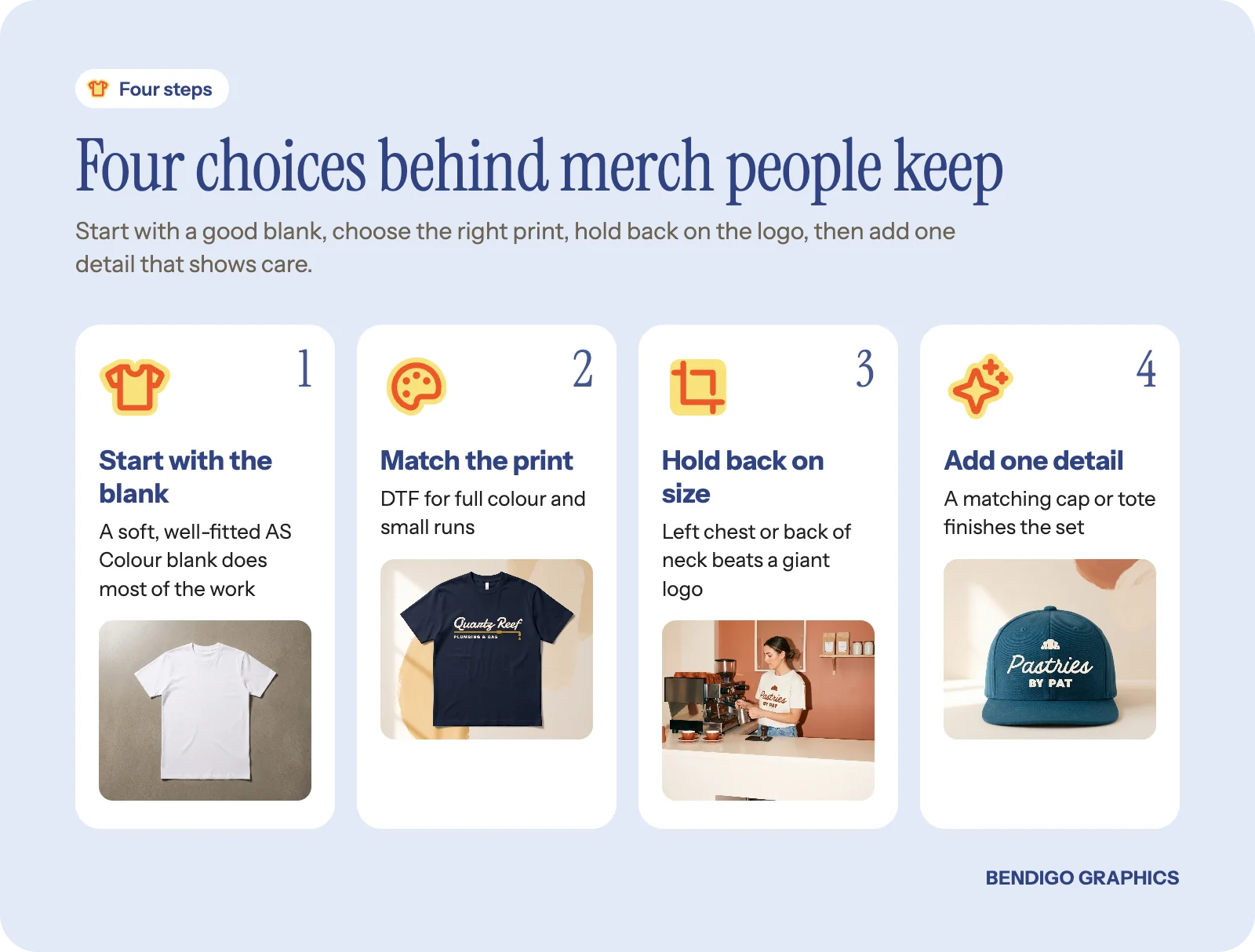
We use AS Colour blanks as our standard. The fits are modern, the cotton is combed and ringspun, and the weights feel substantial without being heavy. Plenty of independent Australian labels build their ranges on the same blanks for good reason. Each product page lists the garment's own weight and fabric.
If the merch is meant to be worn outside the house, the blank is not where you cut costs. The Classic tee is a reliable everyday choice, and the Heavy tee has a thicker, boxier feel that suits streetwear-style merch.
How does the print method change the feel?
Every print method has a different hand feel, which is the way the print sits on the fabric when you touch it.
DTF (direct-to-film): sits on top of the fabric with a slight texture you can feel. It is excellent for full colour designs, detailed artwork and small runs. The trade-off is that the printed area breathes a little less than the fabric around it. Our guide to DTF printing explains more.
Screen printing: especially water-based inks, sinks into the fabric and softens with washing until it feels part of the shirt. It suits large runs of simple designs.
Embroidery: adds texture on purpose. A small stitched chest logo on a hoodie or polo reads as premium, because thread feels more substantial than ink.
Quick tip: tell your wearers to wash printed merch inside out in cold water and skip the dryer. Prints stay softer and brighter for much longer.
Design restraint makes merch wearable
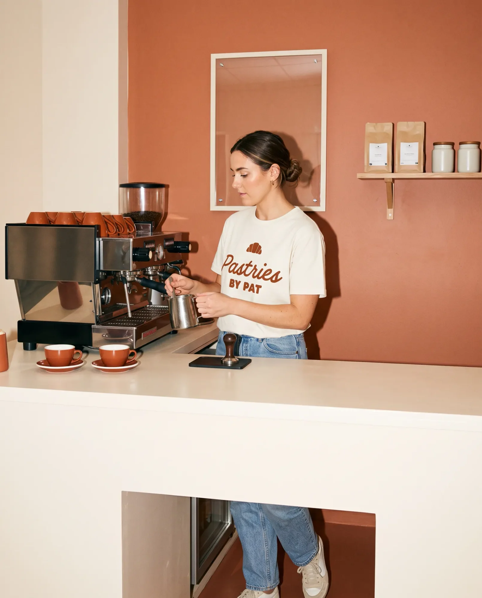
The most common mistake is going too big. A huge logo across the chest looks like a promotional item. A smaller, considered placement, such as the left chest, the back of the neck or the lower front hem, looks intentional. People wear subtle branding in public. They leave the shouty logo in the drawer.
Colour matters too. A one or two-colour print on a well-chosen garment colour almost always looks better than a full colour explosion. Think about the brands you actually buy and wear: most of them use restrained branding and strong garment colours.
Rule of thumb: if you would not wear it to the pub, the logo is probably too big. Try a left chest or back-of-neck placement and let the garment colour do the talking.
Where does the logo look best?
It depends on the garment and the wearer, but a few placements work almost every time:
Left chest: small and tidy, ideal for staff shirts and everyday merch.
Full back: the place for a bigger graphic, with a small front logo to balance it.
Back of neck: a quiet detail that people notice when they look twice.
Cap front: a simple mark on a stock cap turns a tee order into a set.
Our apparel designer lets you place artwork on each garment's real print areas and see it on the shirt before our team checks it.
Details that separate good from great
A printed neck label instead of a sewn tag. A woven tag on the hem. Embroidery thread matched to your brand colours. A print on the inside of a tote bag as well as the outside. These small touches add up to something that feels made by someone who cares, not someone filling an order. They will not all suit every budget, but knowing they exist helps you decide where to invest when you can.
Merch that works for a business
For a cafe, shop or venue, good merch does two jobs: it dresses the team and it gives regulars something to take home. Keep the staff version simple and consistent, and let the retail version be a little more playful. If you are testing the idea, start small; our guide to merch without ordering hundreds shows how.
Common questions
What makes branded merchandise feel high quality?
A soft, well-fitted blank, a print method that suits the design and a restrained logo placement. The blank matters most.
Is DTF printing good quality?
Yes, for full colour designs, detailed artwork and small runs. It has a slight feel on the fabric, and it lasts well when washed inside out in cold water.
What size should a chest logo be?
Smaller than most people expect. A left chest logo that fits comfortably inside the width of a palm looks considered on most shirts. Check it on a mockup before you order.
Browse the range: our apparel page has tees, hoodies, polos and caps, each priced live on its product page. Choose your blank and colours, then upload your design or have us design it.